Здесь представлен обзор 38 статей, разбитых на 4 категории по способам реализации.
Простой, семантически правильный CSS блок с чистым кодом
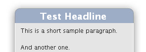
Создает блок и добавляет возможность создания заголовка блока. Тянется по ширине и высоте. Несмотря на тень на примере, реализации полупрозрачной тени не предусмотрено.
Код:
<div class="sidebox">
	<div class="boxhead"><h2>Test Headline</h2></div>
	<div class="boxbody">
		<p>This is a short sample paragraph.</p>
		<p>And another one.</p>
	</div>
</div>

The CSS:
/* Show only to IE PC \*/
* html .boxhead h2 {height: 1%;} /* For IE 5 PC */

.sidebox {
	margin: 0 auto; /* center for now */
	width: 17em; /* ems so it will grow */
	background: url(sbbody-r.gif) no-repeat bottom right;
	font-size: 100%;
}
.boxhead {
	background: url(sbhead-r.gif) no-repeat top right;
	margin: 0;
	padding: 0;
	text-align: center;
}
.boxhead h2 {
	background: url(sbhead-l.gif) no-repeat top left;
	margin: 0;
	padding: 22px 30px 5px;
	color: white;
	font-weight: bold;
	font-size: 1.2em;
	line-height: 1em;
	text-shadow: rgba(0,0,0,.4) 0px 2px 5px; /* Safari-only, but cool */
}
.boxbody {
	background: url(sbbody-l.gif) no-repeat bottom left;
	margin: 0;
	padding: 5px 30px 31px;
}
 Круглые углы в CSS
Очень приятный внешний вид, простая реализация, малое количество HTML-элементов. К минусам, пожалуй, можно отнести только наличие 4 картинок для каждого из углов. Но увы не работает в IE.
Используемые изображения:


Верхние левые и верхние правые углы созданы, используя следующее правило CSS:
Код:
.rounded:before {
  background: transparent url(top-right.png) scroll no-repeat top right;
  margin-bottom: -20px;
  height: 30px;
  display: block;
  border: none;
  content: url(top-left.png);
  padding: 0;
  line-height: 0.1;
  font-size: 1px;
}
Нижние левые, и нижние правые углы созданы с подобным правилом, только используя
:after псевдо элемент:
Код:
.rounded:after {
  display: block;
  line-height: 0.1;
  font-size: 1px;
  content:  url(bottom-left.png);
  margin: 0 0 -1px 0;
  height: 30px;
  background: white;
  background: transparent url(bottom-right.png) scroll no-repeat bottom right ;
  padding: 0;
}
 CSS тизер-блок
Предусмотрена реализация как одно- так и двух-картиночного метода. Малое количество HTML-элементов. Очень удобно для создания тизеров.
Код:
.teaser {
		width:430px;
		padding:0 0 14px 0;
		margin:10px auto;
		background:url("tsr.gif") bottom left no-repeat;
	}
tsr.gif
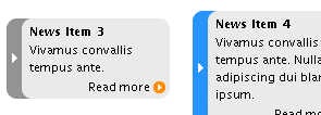
 Ссылки на последние новости
Очень интересное решение на основе неупорядоченного списка. Плюсом будет простая реализация и малое количество HTML-элементов. Приятное оформление с функцией изменения цвета при наведении мышкой (но эта приятность не работает в IE).
Код:
<style type="text/css" media="screen,print">
	html,body {
		margin:0;
		padding:0;
		color:#000;
		background:#fff;
	}
	body {
		padding:10px;
		font:76%/140% "Lucida Grande", "Lucida Sans Unicode", Arial, Helvetica, sans-serif;
	}
	#labfooter {
		text-align:center;
		clear:both;
	}

	#news {
		margin:1em auto;
		padding:0;
		width:150px;
		font-size:0.94em;
		list-style:none;
	}
	#news li {
		background:url("box.gif") 0 100% no-repeat;
		padding:0 0 4px 0;
		margin:8px 0 0 0;
		display:block;
	}
	#news li p {
		background:#eaeaea;
		padding:1px 4px 0 7px;
		margin:0;
		border-left:14px solid #939393;
	}
	#news li.arr p {
		background:#eaeaea url("edge.gif") 0 50% repeat-y;
		padding-left:21px;
		border:0;
	}
	#news h4 {
		font-size:1em;
		line-height:1em;
		font-weight:bold;
		background:url("box.gif") 0 0 no-repeat;
		margin:0;
		padding:6px 4px 3px 21px;
	}
	#news li:hover {
		background-position:-150px 100%;
	}
	#news li:hover p {
		border-color:#2793ff;
	}
	#news li.arr:hover p {
		background-image:url("edge-h.gif");
	}
	#news li:hover h4 {
		background-position:-150px 0;
	}
	#news a:link {
		text-decoration:none;
		color:#000;
	}
	#news a:visited {
		text-decoration:none;
		color:#606;
	}
	#news a:hover {
		text-decoration:underline;
	}
	#news .more {
		line-height:1em;
		display:block;
		text-align:right;
		padding:0 18px 2px 21px;
		margin-top:4px;
		background:url("arrow.gif") 135px 50% no-repeat;
	}
	</style>


<ul id="news">
	<li>
		<h4><a href="#">News Item 1</a></h4>
		<p>Nulla dictum. Praesent turpis libero, pretium in, pretium ac, malesuada sed, ligula.</p>
		<a href="#" class="more" title="Continue reading News Item 1">Read more</a>
	</li>
	<li>
		<h4><a href="#">News Item 2</a></h4>
		<p>Nullam adipiscing dui blandit ipsum.</p>

		<a href="#" class="more" title="Continue reading News Item 2">Read more</a>
	</li>
	<li class="arr">
		<h4><a href="#">News Item 3</a></h4>
		<p>Vivamus convallis tempus ante.</p>
		<a href="#" class="more" title="Continue reading News Item 3">Read more</a>
	</li>
	<li class="arr">
		<h4><a href="#">News Item 4</a></h4>
		<p>Vivamus convallis tempus ante. Nullam adipiscing dui blandit ipsum.</p>
		<a href="#" class="more" title="Continue reading News Item 4">Read more</a>
	</li>
</ul>
box.gif edge.gif edge-h.gif
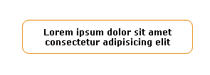
 CSS и круглые углы: Границы с дугами
Неоспоримым минусом является наличие 8 дивов для реализации. Так же в статье есть описание другого метода, в котором используется в 2 раза меньше дивов, но блок залит цветом.
Код:
<style type="text/css">
.b {background: url(dot.gif) 0 100% repeat-x}
.l {background: url(dot.gif) 0 0 repeat-y}
.r {background: url(dot.gif) 100% 0 repeat-y}
</style>

<div class="t"><div class="b"><div class="l"><div class="r"><div class="bl"><div class="br"><div class="tl"><div class="tr">
Lorem ipsum dolor sit amet consectetur adipisicing elit
</div></div></div></div></div></div></div></div>
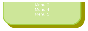
 Создание скругленного блока или дизайн с CSS и XHTML
Как и в предыдущем способе все реализовано на основе списка определений. В статье рассмотрено два способа реализации. Так же появилась возможность тянущейся ширины.
css
Код:
dl { /* block position that can be changed at will */
position: absolute;
left: 50px;
top: 20px;
width: 275px; /* width of block according to your background image */
}

dl, dt, dd { /* suppression of all margins and paddings */
margin: 0;
padding: 0;
}

dl { /* by default background on the entire block */
background: url(bas.gif) bottom left no-repeat;
padding-bottom: 40px; /* so that text will not appear on the bottom rounded edge */
}

dt { /* bloc title definition */
height: 40px;
background: url(haut.gif) top left no-repeat;
font-size: 1.3em;
font-weight: bold;
text-align: center;
}

dd {
padding: 0 20px 0 10px; /* internal block spaces administration */
text-align: justify;
background: url(milieu.gif) top left repeat-y; /* internal background */
}
html
Код:
<body>
	<dl>
		<dt>My beautiful space</dt>
		<dd>Lorem ipsum dolor sit amet, bla bla bla bla...</dd>
	</dl>
</body>
 «Пуленепробиваемые» круглые углы
Очень подробная статья с большим количеством примеров. Но достаточно сложная реализация. К тому же используется 4 картинки.
HTML:
Код:
<div class="contentWrapper">
<div class="content">
<img class="borderTL" src="/images/borderTL.gif" alt="" width="14" height="14" />
<img class="borderTR" src="/images/borderTR.gif" alt="" width="14" height="14" />
<h1>Here be content!</h1>
<!-- IE5/win puts the margin-bottom of the content div's final element
OUTSIDE the containing box (div.content), instead of putting it inside
the containing box's edge. So it needs this spacer. -->
<div class="roundedCornerSpacer"> </div>
</div><!-- end of div.content -->
<div class="bottomCorners">
<img class="borderBL" src="/images/borderBL.gif" alt="" width="14" height="14" />
<img class="borderBR" src="/images/borderBR.gif" alt="" width="14" height="14" />
</div>
</div><!-- end of div.contentWrapper -->
CSS:
Код:
.roundedCornerSpacer {
  margin: 0px; padding: 0px; border: 0px;
  clear: both;
  font-size: 1px; line-height: 1px;
}
/* In the CSS below, the numbers used are the following:
   1px: the width of the border
   3px: a fudge factor needed for IE5/win (see below)
   4px: the width of the border (1px) plus the 3px IE5/win fudge factor
   14px: the width or height of the border image
*/
.borderTL, .borderTR, .borderBL, .borderBR {
  width: 14px; height: 14px;
  padding: 0px; border: 0px;
  z-index: 99;
}
.borderTL, .borderBL { float: left;  clear: both; }
.borderTR, .borderBR { float: right; clear: right; }
.borderTL { margin:  -1px  0px  0px -1px; }
.borderTR { margin:  -1px -1px  0px  0px; }
.borderBL { margin: -14px  0px  0px  0px; }
.borderBR { margin: -14px  0px  0px  0px; }
/* IE5-5.5/win needs the border scooted to the left or right by an
   additional 3px!   Why?  */
.borderTL {
  margin-left: -4px;
  ma\rgin-left: -1px;
}
html>body .borderTL  {
  margin-left: -1px;
}
.borderTR {
  margin-right: -4px;
  ma\rgin-right: -1px;
}
html>body .borderTR  {
  margin-right: -1px;
}
.borderBL {
  margin-left: -3px;
  ma\rgin-left: 0px;
}
html>body .borderBL {
  margin-left: 0px;
}
.borderBR {
  margin-right: -3px;
  ma\rgin-right: 0px;
}
html>body .borderBR {
  margin-right: 0px;
}
/* To get around a known bug in IE5/win, apply the
   border (no margin, padding or positioning) to the
   content class and apply whatever positioning you
   want to the contentWrapper class. */
.content {
  margin: 0px;
  padding: 0px;
  border: 1px solid #000000;
}
.contentWrapper {
  /* position this div however you want, but
     keep its padding and border at zero */
  padding: 0px;
  border: 0px;
}
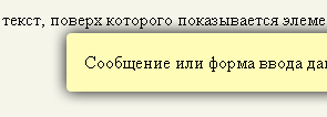
Рисование теней и рамок элементов оформления
Статья Владимира Токмакова. Весьма сложная реализация, но к плюсам, конечно, относится возможность создания полупрозрачных теней. Статья на русском.
Код:
<style type="text/css">
.framed,
.framed .f_r,
.framed .f_b,
.framed .f_l,
.framed .f_c
{
float: left;
position: relative; z-index: 1;
width: auto; height: auto;
margin: 0; padding: 0;
}
.framed .f_tt,
.framed .f_rr,
.framed .f_bb,
.framed .f_ll
{
display: none;
}
.framed
{
margin: 0 30px 15px 0;
background: url('hint-t.png') no-repeat left top;
//background: none;
}
.framed .f_r
{
left: 30px;
background: url('hint-r.png') no-repeat right top;
//background: none;
}
.framed .f_b
{
top: 30px;
background: url('hint-b.png') no-repeat right bottom;
//background: none;
}
.framed .f_c
{
float: none;
position: relative;
left: 30px; top: -15px;
padding: 1px 0; margin: 0 30px 0 0;
background: #fffcb8;
}
.framed .f_l
{
left: -30px;
padding: 15px 0;
background: url('hint-l.png') no-repeat left bottom;
//background: none;
}
* html .framed .f_r,
* html .framed .f_b,
* html .framed .f_l
{ height: 0; }
* html .framed .f_tt,
* html .framed .f_rr,
* html .framed .f_bb,
* html .framed .f_bb *,
* html .framed .f_ll,
* html .framed .f_ll *
{
display: block;
position: absolute;
left: 0; top: 0;
}
* html .framed .f_tt
{
filter: progid:DXImageTransform.Microsoft.AlphaImageLoader(src=hint-t.png,sizingMethod=crop);
}
* html .framed .f_rr
{
filter: progid:DXImageTransform.Microsoft.AlphaImageLoader(src=hint-r.png,sizingMethod=crop);
}
* html .framed .f_tt,
* html .framed .f_bb
{
width: expression( parentNode.offsetWidth ); height: 30px;
}
* html .framed .f_rr,
* html .framed .f_ll
{
width: 30px; height: expression( parentNode.offsetHeight );
}
* html .framed .f_bb,
* html .framed .f_ll
{
overflow: hidden;
}
* html .framed .f_bb *
{
width: 3000px; height: 30px;
filter: progid:DXImageTransform.Microsoft.AlphaImageLoader(src=hint-b.png,sizingMethod=crop);
}
* html .framed .f_ll *
{
width: 30px; height: 3000px;
filter: progid:DXImageTransform.Microsoft.AlphaImageLoader(src=hint-l.png,sizingMethod=crop);
}
/* Исправляем неправильный расчет позиции при "нечетной ширине" */
* html .framed .f_rr,
* html .framed .f_bb *
{ right: expression( this.parentNode.offsetWidth % 2 ? -1 : 0 ); left: auto; }
* html .framed .f_ll,
* html .framed .f_ll *,
* html .framed .f_bb,
* html .framed .f_bb *
{ bottom: expression( this.parentNode.offsetHeight % 2 ? -1 : 0 ); top: auto; }
</style>
<div style="position: relative; height: 7em;">
    <p>Любой текст, поверх которого показывается элемент.</p>
    <div class="framed" style="position: absolute; left: 6em; top: 0.5em;">
        <div class="f_tt"></div>
        <div class="f_r"><div class="f_rr"></div>
            <div class="f_b"><div class="f_bb"><div></div></div>
                <div class="f_l"><div class="f_ll"><div></div></div>
                    <div class="f_c">
                        Сообщение или форма ввода данных.
                    </div>
                </div>
            </div>
        </div>
    </div>
</div>